Newcastle United unveiled a new club crest on 1 October 2026, the first change since 1988. The Magpies spent over two years consulting fans after saying the old design was too detailed for digital screens, merchandise and broadcasts.
More than 27,000 eligible supporters voted with nearly 65% picking the winning option. The new version keeps the castle, seahorses (hippocampi), black-and-white shield and lion but makes them cleaner, sharper and more symmetrical.
Subtle tweaks, mixed feelings
Many fans see only small differences at first glance. The castle is wider and more prominent; the seahorses are simpler and even and the overall shape is more angular.
The club says it honours heritage while fixing reproduction problems. Players will wear it on kits from the 2027-28 season, starting with a final-day preview against Crystal Palace. Earlier leaked ideas drew strong criticism, so the club stressed evolution over revolution.
A long list of badge disasters
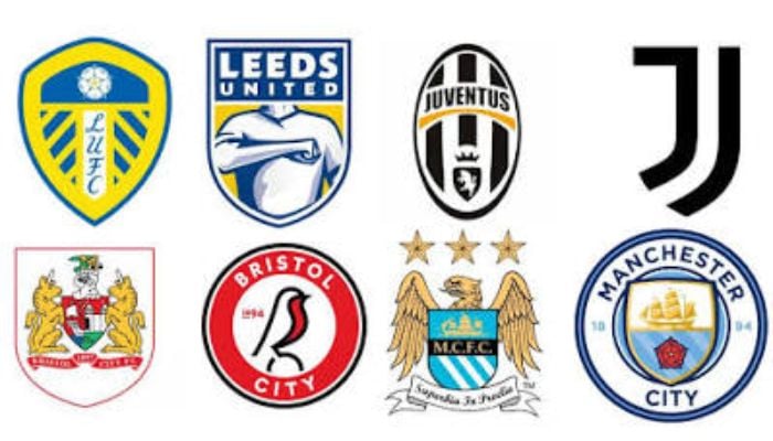
Newcastle joins other clubs whose redesigns angered supporters. Juventus replaced its classic oval striped crest with a plain black-and-white “J” in 2017, widely called soulless. Leeds United proposed a fist-pumping figure design in 2018 that was scrapped within days after huge backlash.
Cardiff City’s Malaysian owner switched colors from blue to red and replaced the bluebird with a dragon between 2012 and 2015, sparking protests until the club reversed course.
Inter Milan’s 2021 update striped gold details for a flatter look. Everton’s short-lived 2013 version removed the club motto and faced petitions. Aston Villa’s recent circular crest lasted only one season before another change. Hull City, Manchester City and other have also faced criticism for modernizing away from traditional symbols.
Clubs often cite digital needs and global branding. Fans usually prefer heritage. Newcastle’s careful process and fan vote may limit the damage but history shows many badge changes leave supporters feeling the club sold its identity.