Google Messages has introduced a significant redesign of the gallery and camera interface.
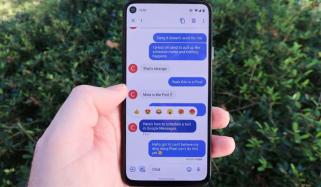
Once you click on the gallery icon in the text field, Google Messages no longer slides up a half sheet that combines a live camera and current photos. Users can receive a full-screen viewfinder that consumes the top portion of the display. The camera controls stay the same as before.
At the bottom, users have a grid showing 3-6 of your recent photos. Swipe up to expand with a “Folders” shortcut at the mid that brings up the system photo picker.
After clicking a new image or choosing an existing one, there is a nice preview with the background blurred. Users can “Write a caption” before sending, while there’s a trash icon in the bottom-left corner. If you are sharing several, swipe left/right to browse.
In the app bar, users can receive “HD” or “HD+” icons. Replacing the preference in Messages > Settings, your options include:
- Optimise for chat: Share quality media rapidly, use less data
- Original quality: Sends at enhanced resolution
This Google Messages gallery + camera redesign experiments for a prolonged time, with it slowly trickling out over a few months. As of Thursday, we’re experiencing it being widely introduced to the stable variant and beta channels.