In a significant update, Apple has dialed back with the latest “Liquid Glass” design in the third developer beta of iOS 26, after receiving numerous complaints regarding the glossy interface's reduced readability.
Officially launched at the Worldwide Developers Conference (WWDC) 2025, Liquid Glass is inspired by the real-world properties of glass.
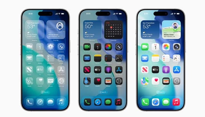
In beta 2, the Cupertino-based tech giant has addressed several issues with Control Centre, which was excessively transparent, causing Home Screen icons and widgets to generate visual clutter.
The latest beta 3 persists this refinement by minimising transparency in several areas of iOS 26, including Notifications and navigation bars in Apple’s built-in apps such as Apple Music.
In Apple Music, for example, the navigation bar has become more powerful and less see-through, utilising a white background for enhanced clarity.
Notifications have also been adjusted, with darker backgrounds improving text contrast for enhanced legibility.
While these changes have enhanced usability, some users argue Apple may have overadjusted, bringing back a heavier “frosted glass” feel. Still, the company’s current approach highlights the experimental nature of developer releases.
These variants exist to receive feedback and resolve problems prior to the public launch expected in the near future.
Apple is expected to continue striking a balance between its stellar design and functionality, focusing on an optimal blend of visual appeal and usability across the entire operating system.