Spotify rolls out new logo on 20th anniversary, sparking backlash from fans
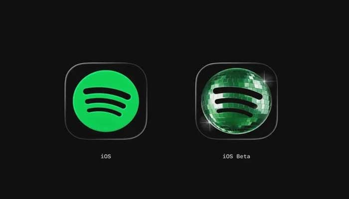
Spotify has officially rolled out a new logo that transforms into a sparkly green disco ball.
The Swedish-music streaming giant has changed the iconic three soundwave line remain, bringing a shimmering, textured masterpiece, sparking mixed reactions from Spotify users online.
The visual change is part of Spotify’s global anniversary campaign, “Spotify 20: Your Party of the Year(s)”, and is not a permanent update to the logo.
Spotify's new logo leaves fans divided by new app design
Several fans took to social media sites such as X (formerly Twitter) to express their frustration.
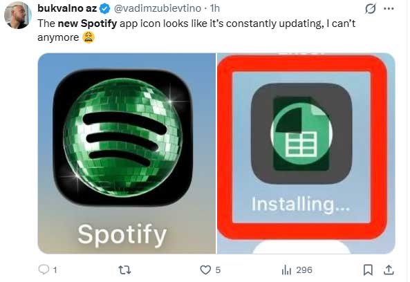
A fan wrote, “The new Spotify app icon looks like it’s constantly updating, I can’t anymore.”
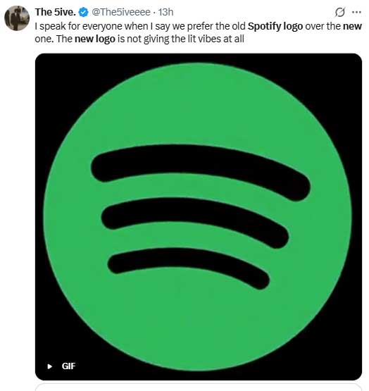
Another fan wrote, “speak for everyone when I say we prefer the old Spotify logo over the new one. The new logo is not giving the lit vibes at all.”
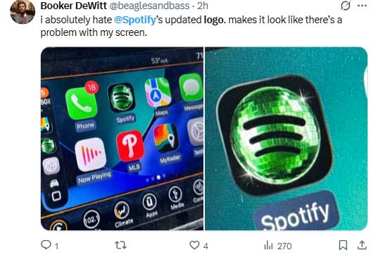
"i absolutely hate @Spotify’s updated logo. makes it look like there’s a problem with my screen," a third fan stated.
Why did Spotify change its logo?
Spotify has not officially acknowledged the icon change. Though theme for the "Party of the Year(s)" is a disco ball is creating confusion among fans whether it would be temporary or permanent.